Scientists create a new world map
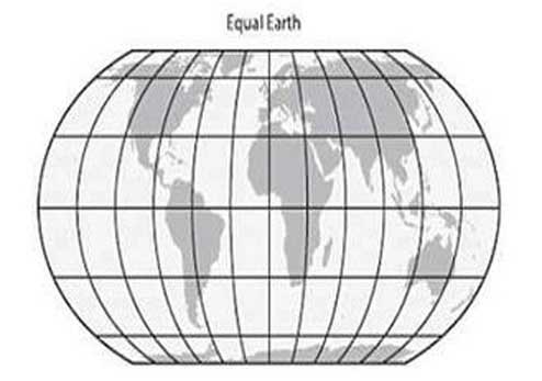
Scientists name new world map Equal Earth
You may be surprised to know that up until now the world map that you saw was incorrect. Actually, there are few flaws in the world map, used in many maps of the world. In some, the size of the continents has been distorted, in some cases its area has been tampered with. Removing this flaw, scientists have created a new map of the Earth. It has been named Equal Earth. The scientists are assuming this is the most accurate map so far.
The hard work of three cartographers
Tom Patterson of the North American Cartographic Information Society in Milwaukee, Bernhard Jenny of Monash University of Melbourne and Bojan Šavrič of the Environmental Systems Research Institute of California have prepared this map.


The three made a new map because in 2017, the Boston Public School in Massachusetts, America, was going to accept the Gall Peters Map as a standard map of the continent with the exact size of the continents.
Gall-peters projection
It was built in 1855 by James Gall. Arno Peters brought it to more people in the 1970s. This is considered as Equal Area Projection Map. But in order to show the exact area of the continents, their size has been broken.
Flaws in the old map
Mercator Projection
This map has been used on a large scale for almost five centuries. Although it shows areas far away from the equator, larger than their actual size. It was built in 1569 by Gerardus Mercator. It was made to see the way in sea voyages. But the area of the continents has been shown to be wrong. For example, Scandinavian countries have been shown larger than India, while India is three times bigger than the total area of all Scandinavian countries. Greenland in the map is larger than Africa, while in fact Africa’s area is 14 times bigger than Greenland. Brazil is five times bigger than Alaska, but Alaska on the map looks bigger than Brazil.
Robinson projection
Arthur Robinson created a new map in 1963, in which lesser changes were made in the area of the continents, but their size has been considerably deteriorated. In it, Robinson showed longitude winding, which would make it look similar to the globe. This map became more popular due to being less distorted. However, due to direct latitude and latitude lines, many people still use the Mercator map.
Better new map
There is an equal distance between the longitude of the new map and it is not too much winding on the outside. This is very similar to the globe’s texture. This makes it look beautiful. The ratio of width to its height is very close to the natural proportion of the Earth.
Map projection
Map projection of the size of the Earth is presented in two dimensions ie 2D. Almost all projections present part of the surface a bit worse because it is almost impossible to show the three dimensions of the earth in two dimensions.